SPD 56
SPD (The Society of Publication Designers) has been a trusted asset and safe space for editorial creatives for over 50 years. They’re especially known for their annual competition, which generates thousands of entries each year.
Because of the 2020 COVID-19 pandemic (still going strong in 2021), many people have been experiencing unprecedented stress and hardship. In response, the SPD board wanted the theme for this year’s competition to reflect joy, rebirth, and perseverance. My objective was to create a name and identity that felt playful, bright, and reminded designers that they still produced great work in 2020 that is worth sharing.
Role: Designer
Executive Director: Keisha Dean
Board of Directors: Mike Schnaidt (President) / Agnethe Glatved (Vice President) / Trevett McCandliss (Vice President) / Lan Yin Bachelis (Secretary) / Jeff Glendenning(Treasurer), David Matt / Emem Offong / Jamie Prokell / Corliss Elizabeth Williams / Lauren Brown / Natalie Gialluca / Ben Grandgenett / Raymond Ho / Ed Levine
Flower Power
The most basic concepts associated with flowers (growth, blooming, beauty, hope, love) are all powerfully positive things. By abstracting the flower into simplified bursts and badges, I was able to visualize these notions and bring variety and nuance to each design.
Same same but different
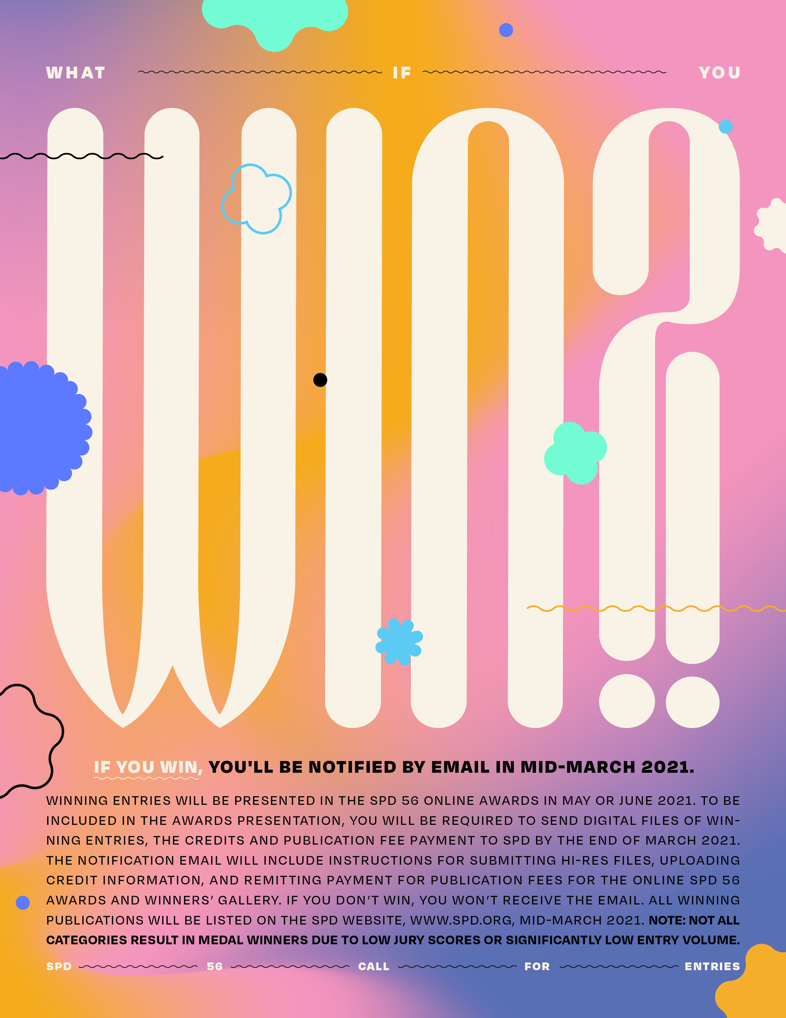
Playful and versatile feel like two words cut from the same cloth. I wanted each promo, banner, one-sheeter, etc. to feel new, yet still being part of the same system. A complex system of expressive type, gradient meshes, and shapes all came together to form a 70’s inspired identity.
Materials for all Platforms
The original request was for a “Call for Entries” pdf that lists all information needed for entering the SPD 56 competition. Following that, I created art for email blasts, Instagram, Twitter, the SPD website, and slides for the keynote presentation that will be featured in the virtual awards ceremony taking place on June 18th.


